My role: Senior product designer.
Team: me (product designer), additional product designer, product manager, CX researcher, web developer, iOS developer, Smart TV developer, backend developer, product analyst, 2 QA engineers
Platforms: Smart TV, Web, iOS, Android
Time from idea to production: 2 months
The context
Okko is an over-the-top video streaming platform with 2.4M paying customers. It has a 14% share of the Russia market (which counts around 20 streaming platforms). Okko is a part of Sber, the largest IT company in Russia and the 51st largest in the world. Around 30% of user accounts in Okko have views by children. Median view time of kids content is 180-230 minutes.
The issues that the project set out to solve
- Content sections created for adults and children are mixed together (revealed by qualitative studies).
- Younger children can see 16+ and 18+ content (revealed by qualitative studies, user reviews, and recent legal regulations).
- Poor performance of the recommendation system (revealed by qualitative studies).
- Children don’t understand the function of certain elements (revealed by qualitative studies).
- Not all content that is offered to a given child suits their age group (e.g. 8 year olds can see content created for 2 year olds).
The hypothesis
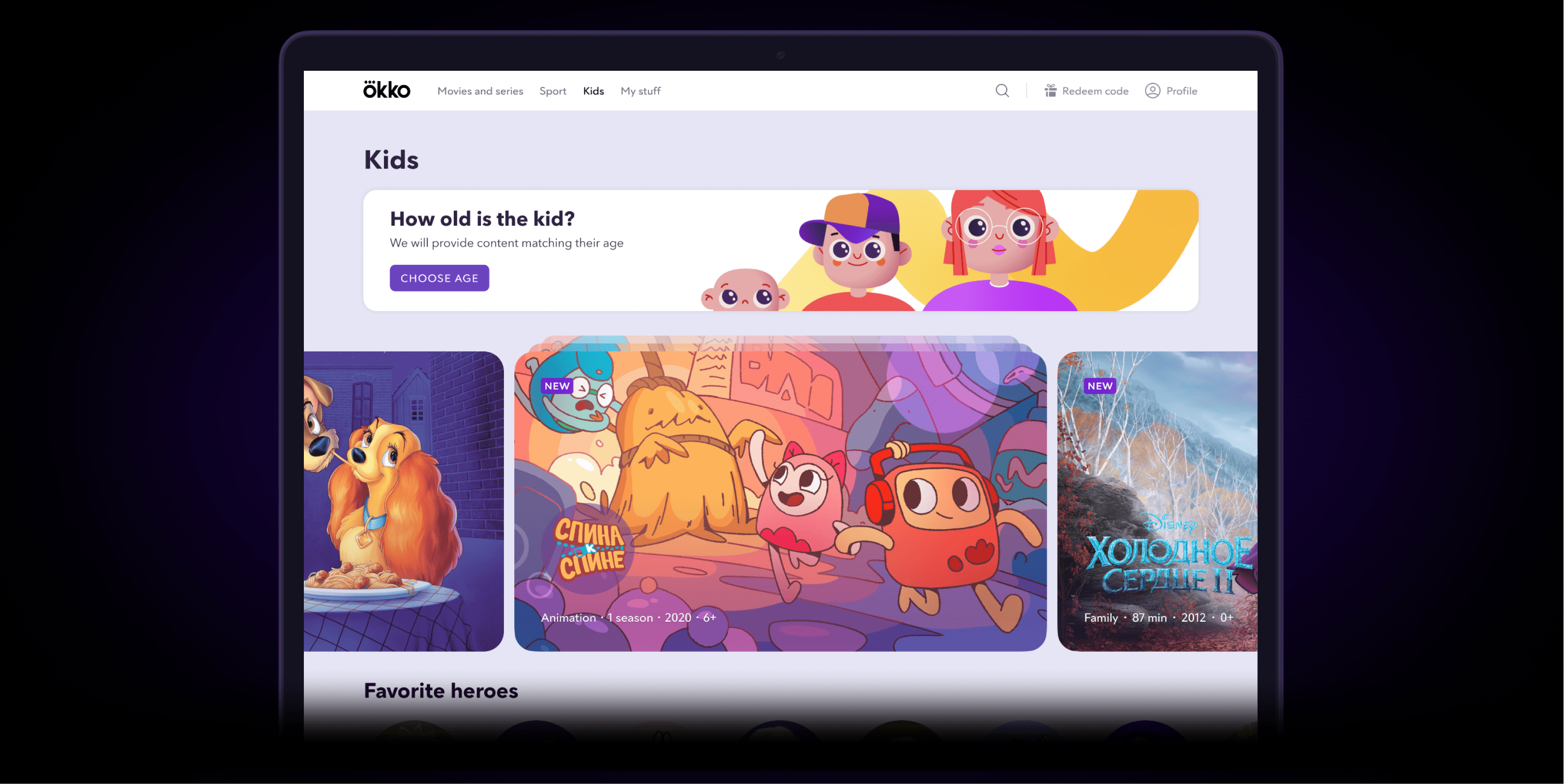
Creating a dedicated page for children would make it easier for them to navigate the content. That would also improve the efficiency of the recommendation engine and ensure children not stumbling upon the content targeted to other age groups. All of this would result in an improvement of UX and an increase in the average view time.
What I have done
- A number of studies have been carried out throughout the course of the project:
1. A week long qualitative study in which parents were keeping diaries of all the activities of their children throughout the day.
2. Metrics analysis with Splunk indicating the number of views by children, the type of content children watch, view duration, how well children react to content collections, etc.
3. A 2 day long Design Thinking session.
4. 3 qualitative studies of different versions of the kids page and its structure.
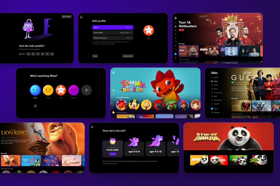
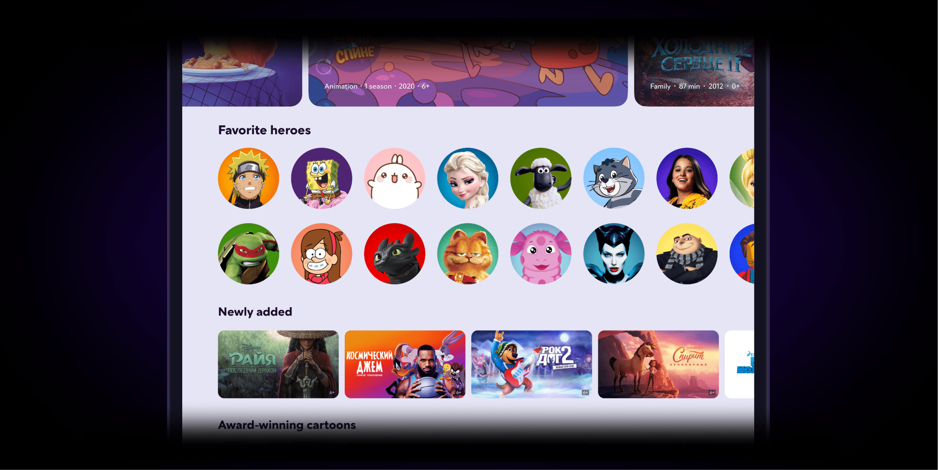
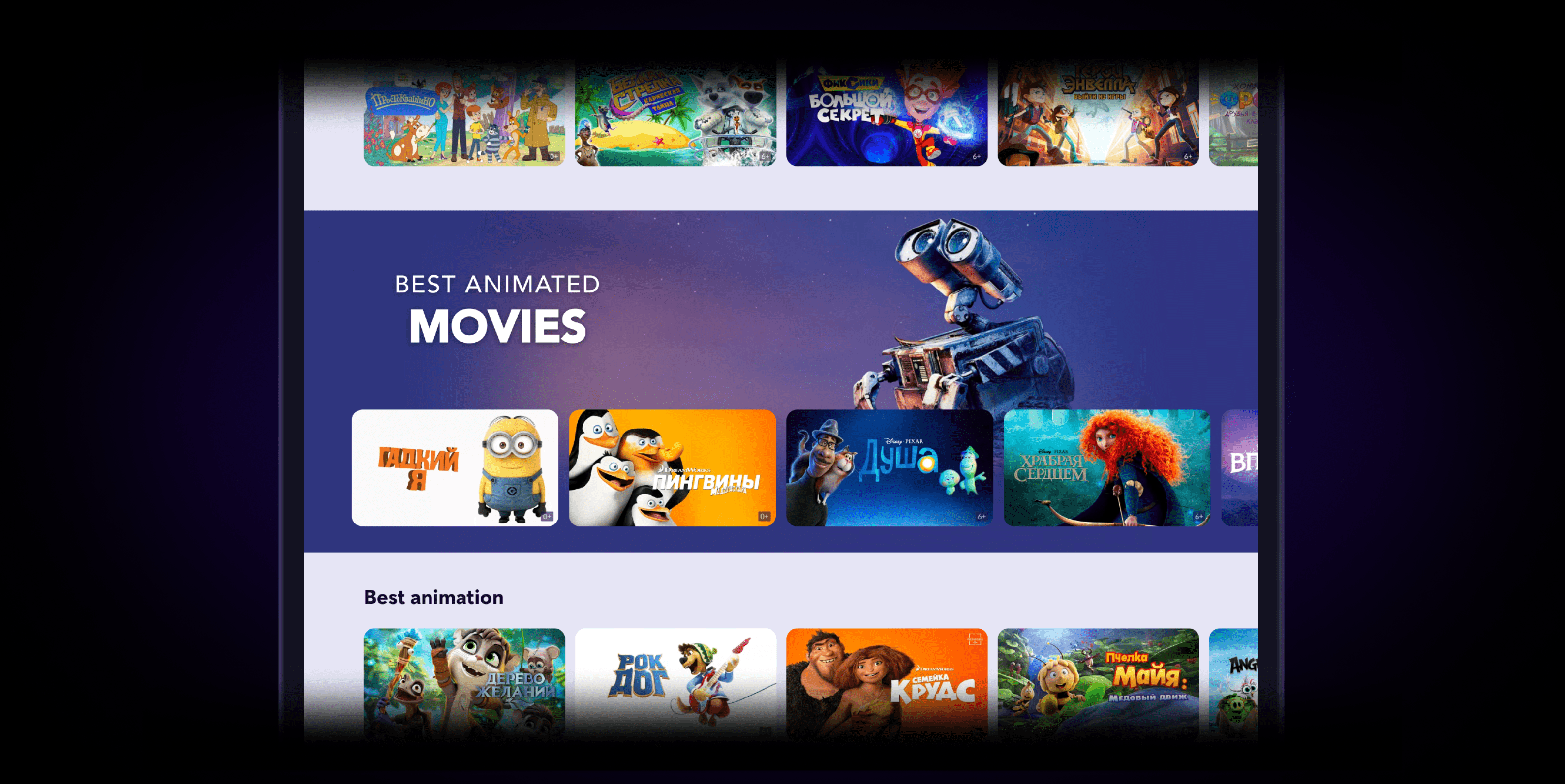
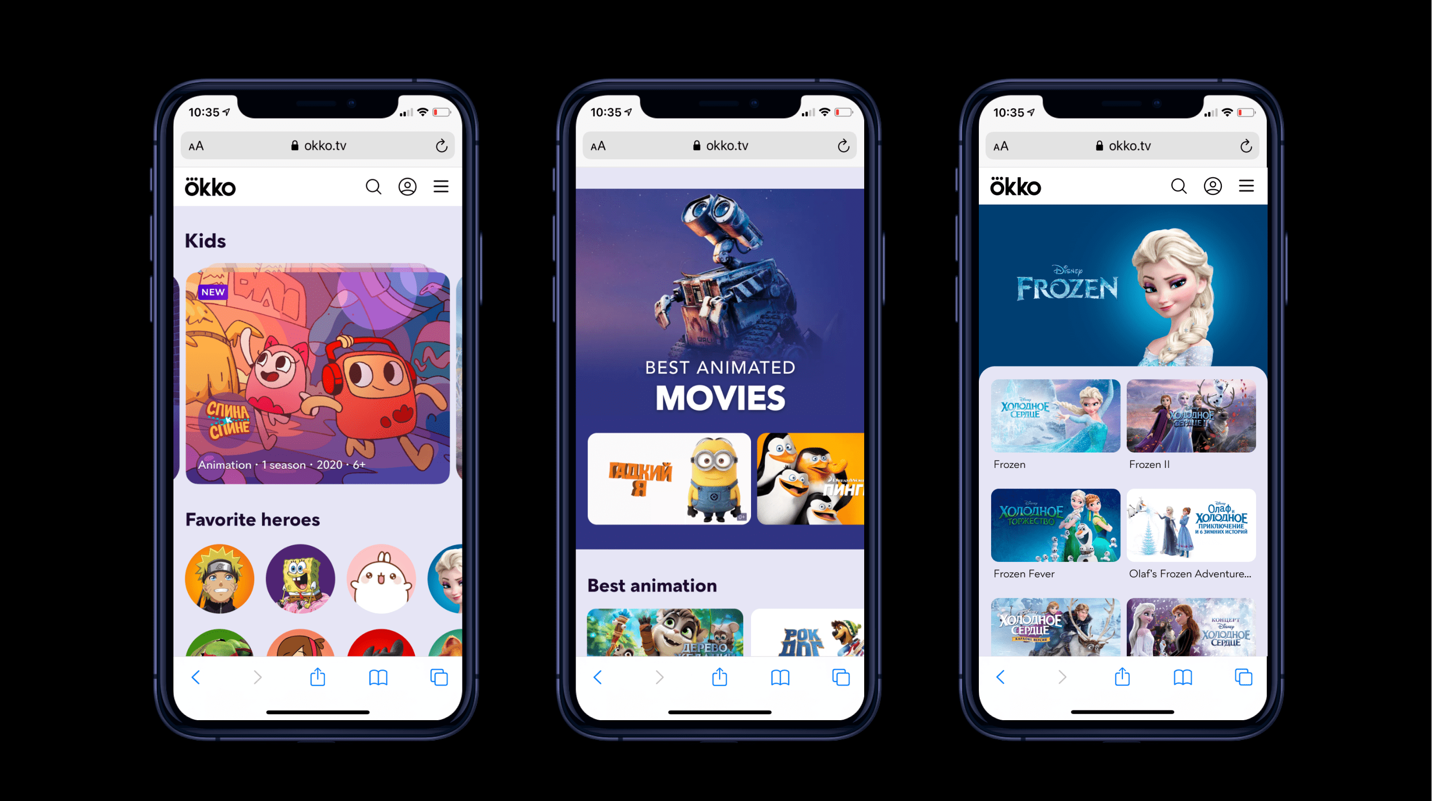
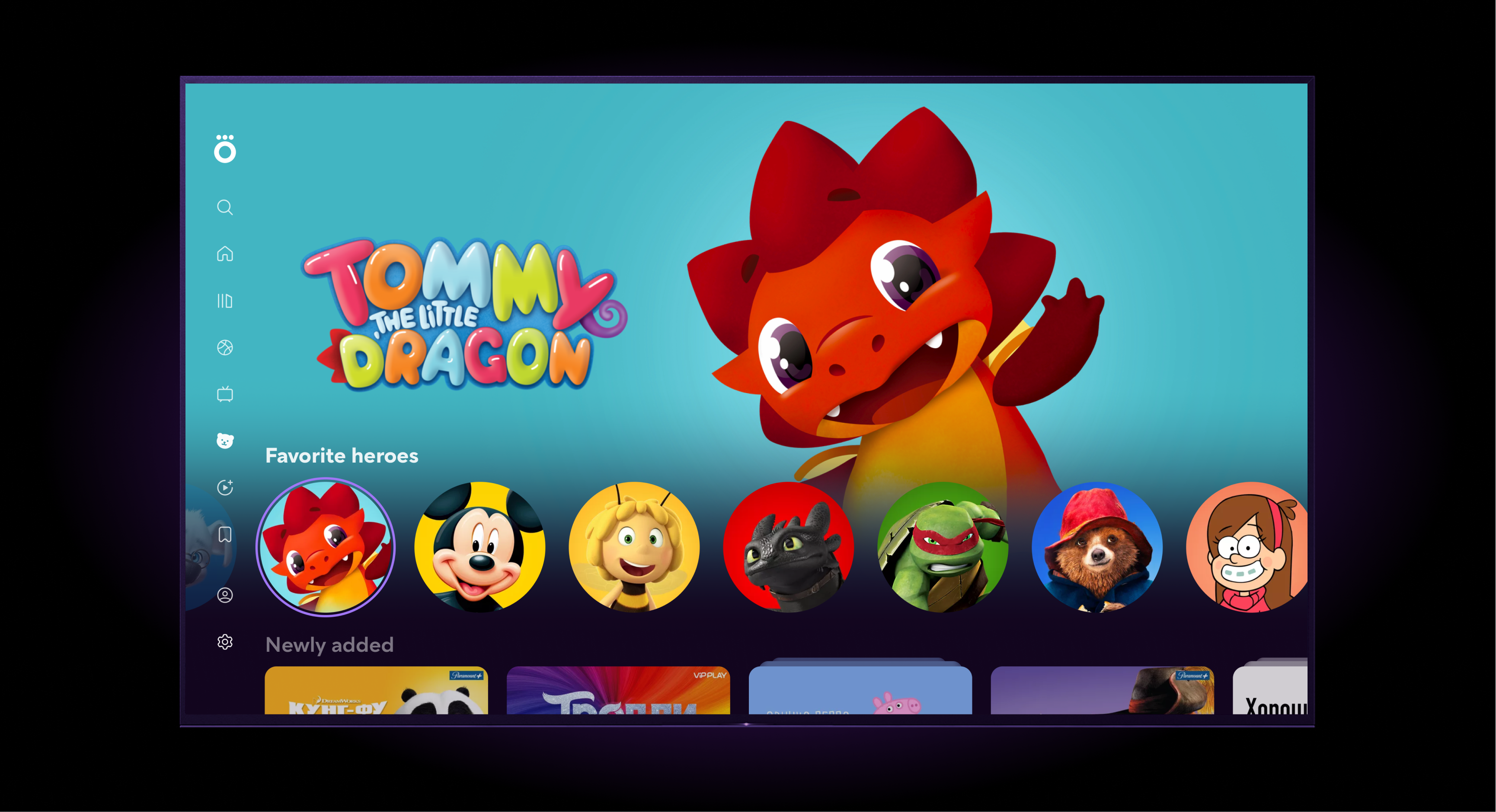
5. A number of quantitative studies testing the efficiency of age selection, and the degree of engagement into content collections and character-based content collections. - A separate design has been created for kids content collections. These used to be visually presented as folders, and were changed to rows of content with custom backgrounds (“rich collection rows”).
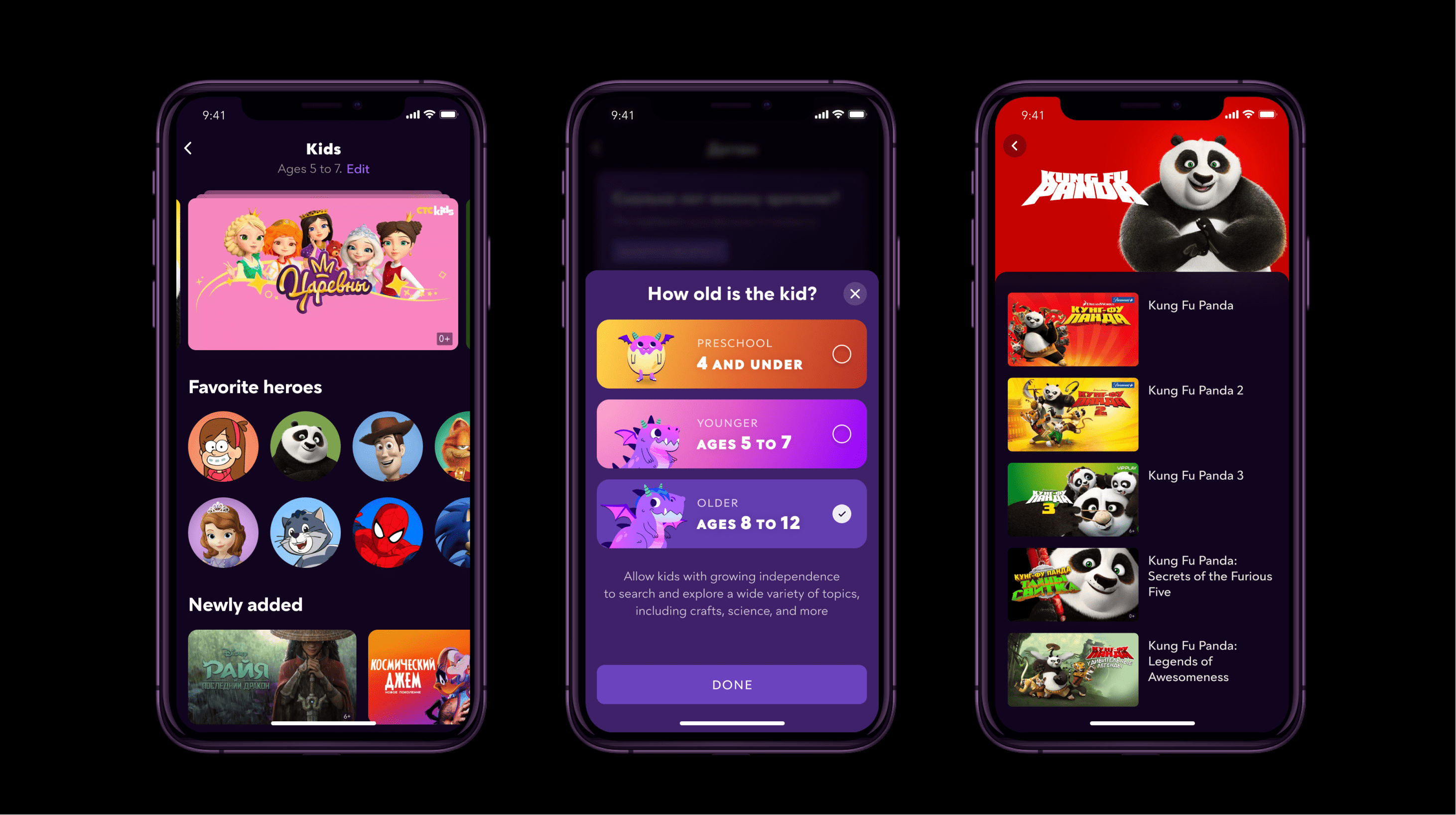
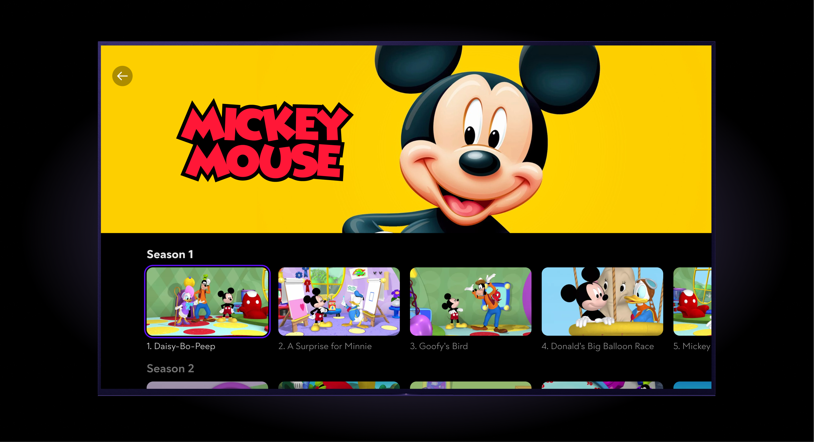
- Monocollection, a special type of content collection that is based on a single character, has been introduced.
- A separate design has been developed for the inner view of monocollections.
- The featured view of kids content has been stripped down of details.
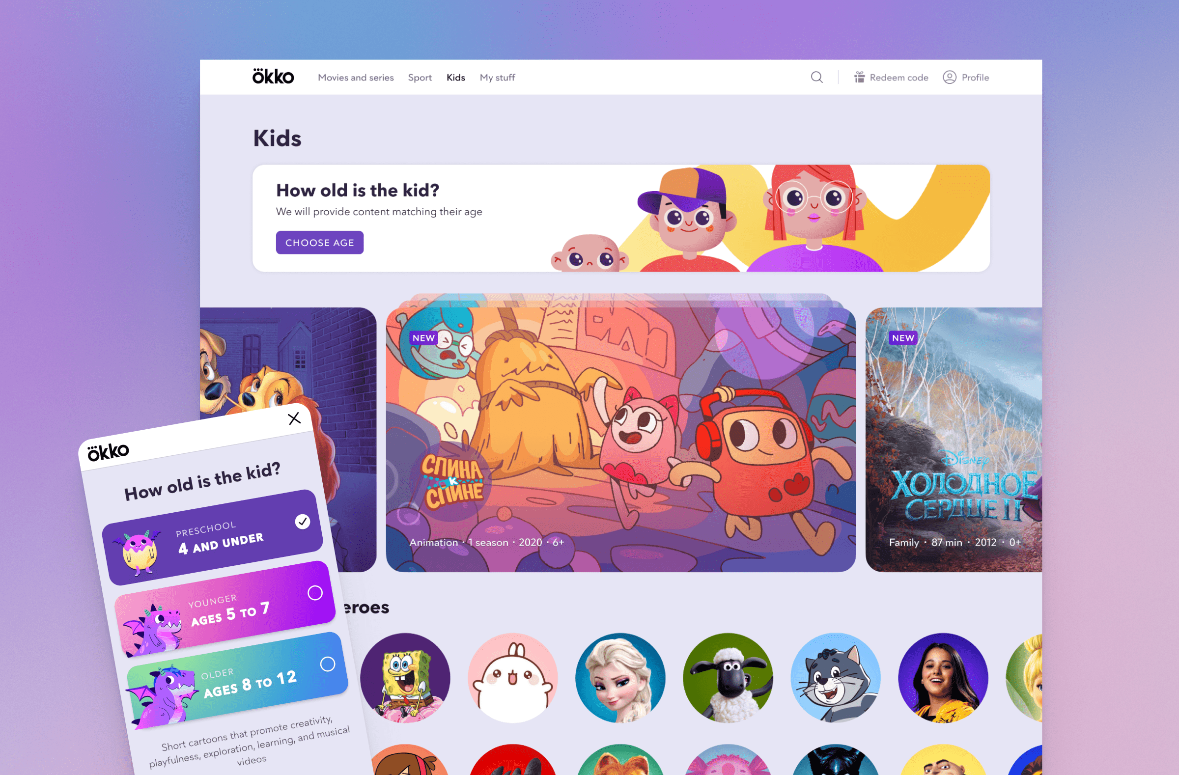
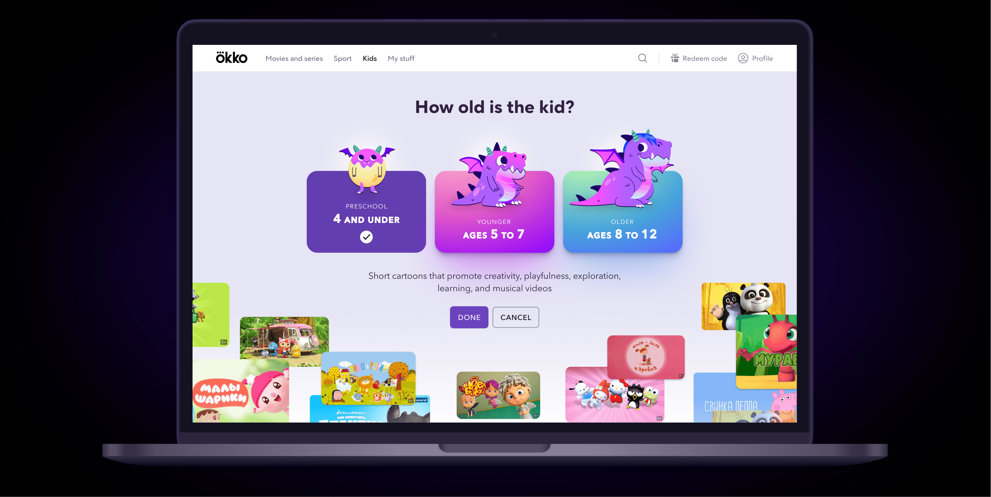
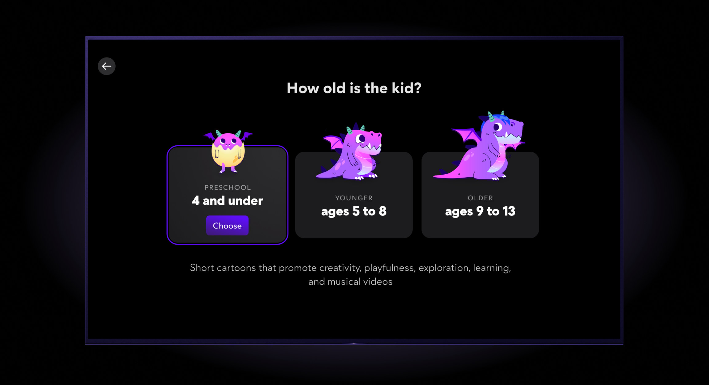
- Age selection step has been added. With examples of content for each age group.
- Qualitative and quantitative CX testing of the new views.
What has been achieved
Introducing a dedicated kids section enabled Okko to reach the following outcome (Family accounts vs. the rest):
- Average revenue per user is 91% higher.
- Average profit per user is 107% higher.
- Average revenue per visit is 158% higher.
- Conversion Rate is 35% higher.
Adding examples of content into the age selection screen has increased the conversion of age selection by 58%.
Rich collection row UI type has proven to be way more engaging than the previous view of content collection. This view has been later implemented into other sections of the platform.
Separating kids content enabled the platform to achieve compliance with legal regulations.
Subjective user satisfaction when using the kids section of the platform measured with the SUS scale has achieved 88.8%.